

Style
Mastering the Interior Design Colour Palette: From Colour Wheel to Real Rooms

Creating a sophisticated interior design colour palette is both an art and a science. When we understand colour theory, colour psychology, and how paint swatches behave in real room settings, we can design spaces that feel cohesive, stylish, and deeply personal. A well-curated colour palette adds structure to our home projects, supports diverse interior design styles, and ensures that every room feels intentional rather than improvised.
By combining the principles behind the colour wheel, practical product knowledge, and modern digital tools such as colour palette generators, we can move from guesswork to expert-level palette curation. Whether we are planning a biophilic design living room, a sleek art deco hallway, or a calm bedroom in soft earth tones, a clear approach to colour scheming sits at the heart of successful interior design.

Understanding Colour Theory and the Colour Wheel in Interior Design
At the foundation of every strong colour palette lies colour theory and the colour wheel. Primary hues such as red, blue, and yellow combine into secondary and tertiary colours, giving us the full spectrum we use in interior design. When we map complementary, analogous, and triadic colour schemes on the colour wheel, we gain a powerful visual guide to colour schemes that actually work in practice.
Complementary colour schemes, such as blue and orange or red and green, introduce high contrast and energy. These pairings are excellent for dynamic spaces that demand visual impact, such as dining rooms or social living areas, especially when controlled with accent colours rather than full-wall treatments. Triadic colour combinations, for example, red, blue, and yellow or green, orange, and purple, bring balanced variety and are ideal when we want a playful, layered palette without sacrificing harmony.
From Colour Psychology to Room Setting: How Colours Make Us Feel
Colour psychology plays a central role in curating a colour palette for real interiors. Soft earth tones like sandy beige, warm taupe, and gentle clay can make a room feel grounded and calm, making them a natural fit for living rooms and bedrooms. Shades such as sky blue or light pink can introduce lightness and serenity, creating restful environments that work beautifully in nurseries, bathrooms, or reading corners.
Bolder accent colours like emerald green, deep navy, or rich burgundy can be used strategically to create focal points. An emerald green feature wall behind a blue sofa, for instance, can anchor the living room while still allowing us to layer in white colour schemes or grey colour schemes in trim, textiles, and accessories. Red and bright yellow colour schemes add energy but should usually be used in controlled amounts to avoid visual fatigue, particularly in small or low-light rooms.
Building a Balanced Palette: Base Colour, Secondary Tones, and Accent Colours
A successful interior design colour palette typically starts with a base colour that covers the largest surfaces. This base colour may be a warm neutral, a crisp white, or a subtle grey, forming a canvas for accent colours and decorative elements. From there, we introduce secondary tones and accent colours using a structure similar to the 60-30-10 principle, ensuring that the palette feels deliberate and well-proportioned.
White colour schemes and grey colour schemes remain popular because they sit comfortably behind a wide range of accent colours and materials, from wood finishes and metal details to bold textiles. Blue colour schemes and green colour schemes are particularly effective when we want to reference nature and move toward biophilic design, which emphasises natural light, plants, and organic textures. Pink colour schemes or soft blush accents add a modern softness to bedrooms and living rooms, while red and yellow colour schemes are often at their best in small doses through artwork, cushions, or a single accent chair.
Drawing Inspiration from Real Products and Designer Styling
Paint brands such as Farrow & Ball and Benjamin Moore offer carefully curated colour brochures and colour palettes that can serve as excellent starting points. Their paint swatch colours often group tones into ready-made colour schemes, showing how different hues interact in a typical room setting. Brands like Glidden Paints, Nippon Paint, and Birla Opus also provide extensive interior emulsions, exterior emulsions, waterproofing paint products, acrylic distemper, enamel paint products, and wood finishes paint products, each with technical information and product advice sheets.
We can study the work of designers such as Justina Blakeney or Kelsey Fischer to see real examples of bold palette curation and biophilic design principles in action. Justina Blakeney is known for her rich use of colour, pattern, and greenery, while designers influenced by art deco often choose strong contrast, metallics, and deep jewel tones like emerald green and sapphire blue. By observing how professionals handle colour perception, colour match, and accent placement, we refine our own designer styling instincts.
Using Colour Palette Generators, Colour Codes, and RGB Values
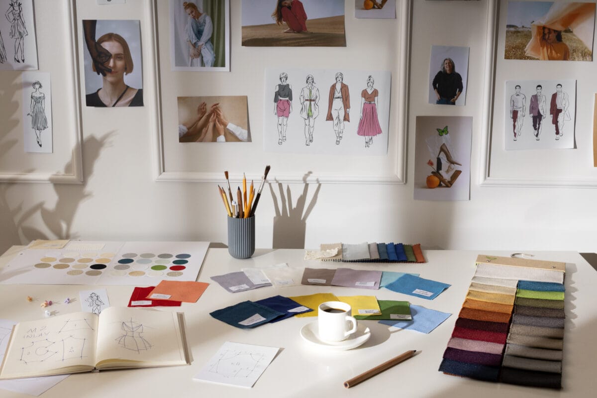
Digital tools allow us to visualise colour before opening a single paint can. Colour palette generators and colour scheme generators, such as Adobe Colour or brand-specific tools often labelled Colour Designer or Visualise Colour, help us test different combinations instantly. These platforms let us enter colour codes or RGB values and see how complementary or triadic palettes might look.
When we use colour palette generators, we can experiment with colour schemes for white, grey, blue, green, red, yellow, and pink, both in isolation and as part of a broader palette. We may start from a photo of a room setting, a piece of art, or a fabric sample and let the tool extract the main colours, then refine the palette manually. While these tools are powerful, we always account for screen settings and lighting conditions in the actual space, since digital mockups can differ from how paint swatches and finishes appear on real walls.
Considering Paint Types, Finishes, and Technical Information
An interior design colour palette is not only about hue; it is also about the right product for the right surface. Interior emulsions create a smooth, wipeable finish for walls and ceilings, while exterior emulsions and waterproofing paint products protect façades and terraces. Acrylic distemper and enamel paint products have distinct properties and are often used in budget-sensitive projects or on metal and wood surfaces. Wood finishes, such as varnishes, stains, and clear coatings, preserve the beauty of wood panelling and furniture.
We also ensure that our chosen paint products provide superior coverage, a long-lasting finish, and the right sheen level. Finishes such as flat, eggshell, satin, or gloss all influence colour perception. A flat eggshell interior emulsion, for example, hides minor wall imperfections and gives a soft, sophisticated look, while a higher-gloss enamel on trim offers durability and crisp definition. Premium range products, such as speciality waterproofing systems and advanced exterior paints like Alldry Wallnroof 10, Calista Sparkle Pu, Allwood PU Exterior, Style Super Bright, or Style Colour Smart, combine colour with performance, which is essential in harsh climates or high-use environments.
Interior Design Styles, Smart Homes, and Lighting Conditions
Different interior design styles demand different approaches to colour palettes. Art deco interiors favour bold contrast, geometric patterns, and luxurious metallics, often built around deep blues, emerald green, black, and warm gold tones. Biophilic design, by contrast, leans on earth tones, sandy beige, sky blue, and soft greens, complemented by natural textures such as stone, linen, and wood finishes. Minimalist or Scandinavian styles tend toward white colour schemes and pale neutrals with carefully chosen accent colours.
Lighting design and lighting conditions are equally influential. In smart homes, where we can adjust colour temperature and intensity of lights throughout the day, the same colour palette can shift in mood from morning to evening. Warm lighting emphasises beige and cream, while cool lighting makes blues and greys more dominant. We account for these shifts when selecting the base colour and accent colours, particularly in multipurpose spaces such as open-plan living-dining areas.
Avoiding Common Design Mistakes in Colour Palette Curation
Many design mistakes in interior colour scheming stem from skipping testing and relying entirely on tiny paint swatches or on-screen samples. Small samples rarely show the full effect of a colour on large surfaces. We recommend testing generous paint swatches on multiple walls, observing them in different lighting conditions over several days. This approach makes it easier to confidently find your colour and avoid a hue that feels too cold, too bright, or too dull once applied.
Another common mistake is introducing too many unrelated colours or finishes, especially in open-plan spaces. Even when we enjoy variety, it is wise to repeat key colours, wood finishes, and metal tones across rooms to maintain visual continuity. A coherent colour palette does not limit creativity; instead, it frames it, allowing us to explore colour variations within a unified scheme that feels like colour for everyone in the household rather than one person’s preference dominating the space.
From Concept to Reality: Bringing Your Colour Palette to Life
Once we have selected our base colour, accent colours, and product types, we bring the concept to life through careful planning and execution. We align our choices with technical information and product advice sheets from manufacturers to ensure compatibility across interior emulsions, exterior paint products, wood finishes, and special coatings. We think in terms of whole-home flow, balancing blue colour schemes in living areas, calm green colour schemes in bedrooms, and clean white or grey colour schemes in circulation spaces.
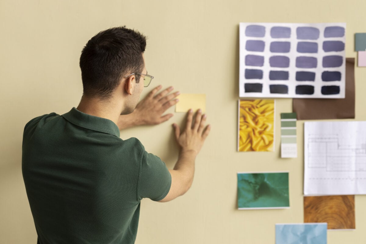
Digital mockups, mood boards, and trial boards that combine paint swatches, fabric samples, flooring, and imagery of furniture, such as a statement blue sofa, help us visualise colour in context. When the final palette respects colour theory, embraces thoughtful accent colours, and acknowledges lighting, material, and product reality, the result is a refined, long-lasting finish that supports both everyday living and future style updates. With the right planning, we not only choose attractive shades but also create timeless colour schemes that align with smart homes, evolving tastes, and the technical demands of modern living.