

Home Decoration
Transformative Living Room Design: The 60-30-10 Rule for Perfect Colour Schemes

Setting the Scene: Why Color Proportions Matter in Living Room Design
We shape the first impressions of any living space through carefully selected color schemes and design principles. The 60-30-10 rule, celebrated by interior designers like Emma Deterding of Kelling Designs and trend leaders at Andrew Martin, provides the blueprint for achieving color harmony in any environment, whether you prefer Scandi-inspired interiors or eclectic, layered looks. Applying this rule extends beyond dominating shades; it ensures an intuitively balanced proportion of color families, thereby strengthening the visual psychology within your décor scheme.
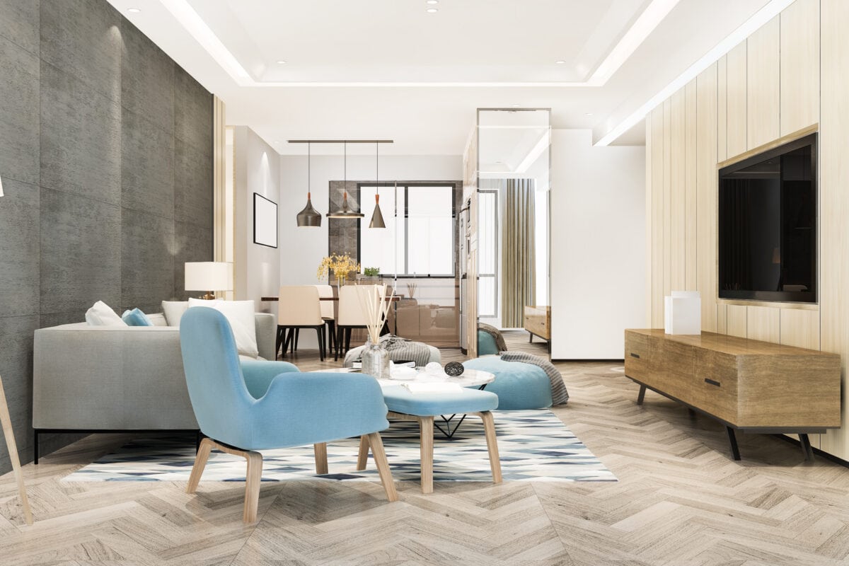
Demystifying the 60-30-10 Rule: Proportions Explained
At its core, the 60-30-10 rule divides your living room’s palette into three distinct shares:
- 60% Dominant Color (Main Color): The foundational hue covers the largest surfaces, such as wall color, flooring, and substantial pieces of furniture like sofas or sideboards. Neutral colors such as F&B’s Dimity and Sulking Room Pink, or earthy greens, are often favored for their longevity and flexibility within changing design elements.
- 30% Secondary Color: This hue supports the dominant base and typically appears on curtains, accent chairs, feature walls, or rugs (such as the Simply Severn Soft Pink Rug by Ruggable Morris & Co). Secondary colors can provide subtle contrast or a bold difference depending on whether a monochromatic palette, split complementary, or tonal design is the aim.
- 10% Accent Color: Accents deliver the punch, providing visual excitement through hot pink decorative pillows, Cobalt Blue vases, Wine Red throws, shiny metals, and architectural features. This proportion includes small, changeable items that reflect color trends, seasonal influences, or personal style evolution.
The allure of this design rule lies in its flexibility: we can update the accent color to reflect interior color trends without revisiting the entire color palette.
Color Theory Meets Psychological Impact
Color psychology plays a defining role in our perception of space. A living room adorned with soothing neutrals as the dominant color evokes calm and openness, while layered accent colors, supported by a feature wall or statement furniture, inject personality and vibrancy. Secondary shades such as Reduced Green or Sulking Room Pink serve to bridge these extremes, allowing the entire room to feel both anchored and dynamic.
Referencing experts like Martin Waller of Andrew Martin and Lena Gierasinska at Barker and Stonehouse, we find that an appropriately balanced color scheme affects both our emotional response and the perceived size of the space. Warm accent colors attract attention and energize, while cool secondary hues promote tranquility and balance.
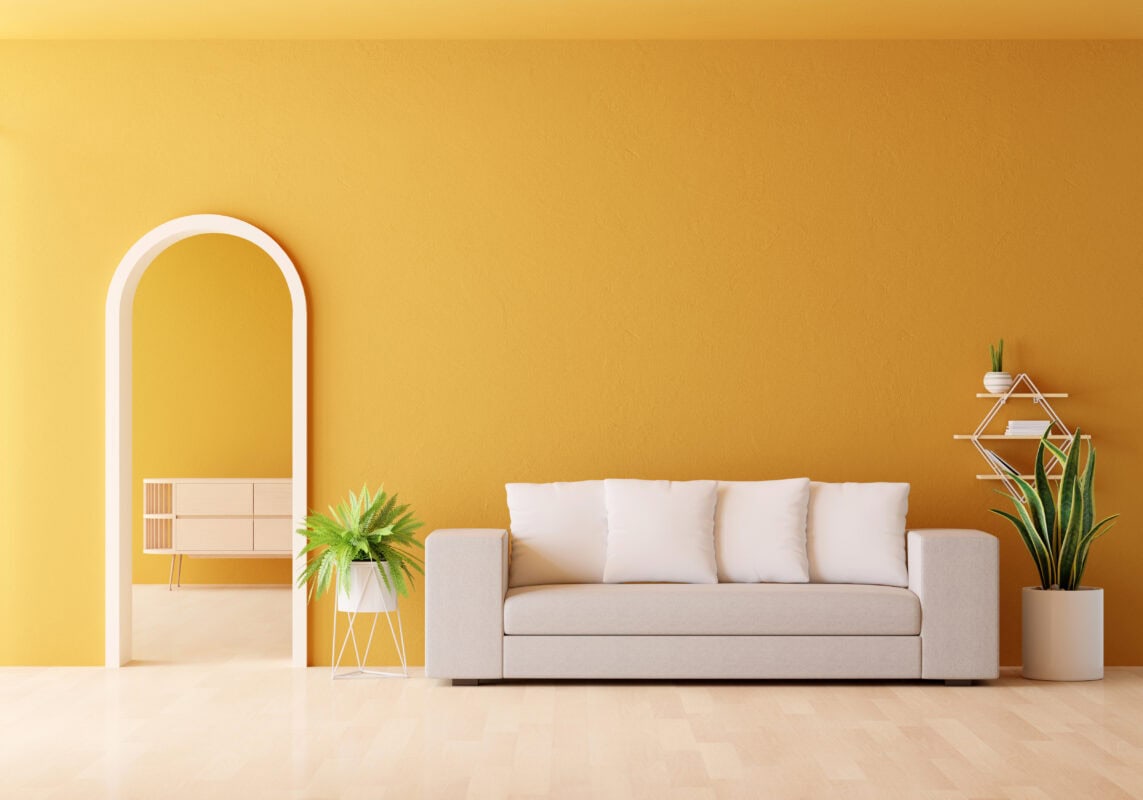
Step-by-Step: Implementing the 60-30-10 Rule in Your Living Room
- Start with Inspiration: Use paint color cards, color pickers, or websites offering pre-curated color palettes to decide on the prominent color family. Farrow & Ball paint charts are a staple among professionals.
- Identify Dominant Surfaces: Paint your walls or select large area rugs and sofas in your chosen primary color for 60% of the space.
- Add Complementary Secondary Colors: Choose a 30% color for accent chairs, curtains, or a feature wall. For a trendy touch, incorporate split complementary or monochrome and tonal palettes.
- Pick Accents with Personality: decorative pillows, throws, metallic vases, or art pieces count for 10%. Rotate these with seasonal changes or new interior decorating trends for a refreshed look.
- Maintain Consistency: Use automation tools, mood boards, or apps to keep your color scheme balanced, even as you introduce new pieces.
Leading Brands and Trend Influencers
We draw inspiration from top brands and designers. Claire Garner’s minimalist décor, ALMA de LUCE’s earthy palettes, and the Atacama sideboard, as well as Hissan Arabi’s armchairs, harmonize perfectly within this rule’s boundaries. Designers frequently cite Ruggable Morris & Co. rugs and Barker and Stonehouse furniture as ideal for integrating secondary and accent shades.
Maximizing Impact: Advanced Color Scheming Tips
- Use Visual Tools: Leverage paint color card decks and digital color pickers to test combinations before making permanent changes.
- Highlight Architectural Features: Accent colors can be applied to cornices, skirtings, or built-in shelving for an unexpected twist.
- Mix Textures and Gloss Levels: Beyond hue, the interplay of matte, gloss, or velvet finishes deepens the sensory appeal of your color palette.
- Reflect Light and Space: In minimalist décor, white paint colors and sleek accent pieces broaden the sense of openness while keeping to the 60/30/10 color rule.
Tackling Common Issues: Color Overwhelm and Clashing
It’s easy to fall prey to color overload or uncertainty about which hues combine best. Utilize color websites and reference proven palettes from interior design professionals, such as Emma Deterding. Monochromatic color schemes offer safe, stylish alternatives, while using color trends sparingly in accent details helps retain cohesion.
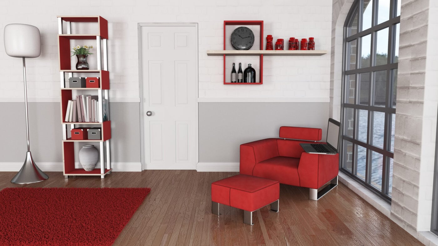
Evolution and Adaptability of Color Palettes
We advocate for an adaptable approach. The 60–30–10 rule is effective whether aiming for maximalist, monochrome and tonal palettes, or subtle split-complementary compositions. With a balanced design scheme, homeowners can introduce trendy elements or elevate minimalist décor simply by swapping decorative items in the 10% accent slot.
Conclusion: The Path to Color Harmony
The 60-30-10 rule stands as a simple design rule ensuring elegance, balance, and cohesion in any living room. By understanding color psychology, leveraging trends wisely, and embracing both classic paint choices and bold accent pieces, we achieve ongoing harmony within our color schemes. This foundational principle remains the benchmark for decorators at every level, from seasoned professionals to style-conscious homeowners, helping every living room shine.