

Uncategorized
How to Choose Exterior Paint Colors: From Color Palette to Lasting Curb Appeal

Choosing exterior paint colors is both a design decision and a long-term investment. The right exterior color palette can transform exterior walls, highlight architectural styles, and add timeless appeal, while the wrong scheme can make even a beautiful house feel disjointed or dated. When we approach the colour selection process thoughtfully, we create a cohesive colour scheme that works with the roof, stone selection, siding styles, window design, and landscaping rather than fighting them. Whether we are refreshing a Victorian house, an Art Deco Queenslander, a contemporary home, or a vintage house with aluminum siding or vinyl windows, the goal is a balanced Exterior Paint Colour scheme that looks intentional from every angle.
To do this well, we combine a creative use of the color wheel with practical considerations such as paint finish, product quality, lighting conditions, and long-term maintenance. We also make good use of modern tools such as 3D model visualisers, PAINT AND STAIN CALCULATOR tools, and sample pots, along with paper paint samples and paint chips from brands like Benjamin Moore, Sherwin-Williams, Farrow & Ball, Dulux Weathershield, Behr, and Resene. By integrating professional guidance from a color consultant, architects such as Dion Seminara Architecture, and resources like Habitat TV, HOME DEPOT Behr Technical Experts, and Paper Moon Painting, we can move beyond guesswork into confident, evidence-based choices.

Start with Architecture, Materials, and Exterior Details
Every successful exterior house color scheme starts with architecture and fixed materials. A Victorian house often suits a layered palette, with deep shades on sills, casings, and exterior details, while a streamlined Art Deco Queenslander might call for a simpler, more graphic exterior palette. Contemporary homes often use crisp white paint and strong contrast, such as charcoal trims or deep accent doors, whereas vintage houses with ornate profiles can support richer, historically inspired tones.
We also consider elements unlikely to change in the near future. Roof color, brick or stone, tile grout, and existing windows or siding narrow our options. For example, a warm-toned roof pairs best with warm neutrals and nature-inspired hues, while cool-toned roofing favors greys, blues, and whites with neutral undertones. Sills, trim, and door casings should tie these elements together, making the façade read as a single, harmonious composition.
Use the Color Wheel and Neutral Undertones to Build a Palette
A colour palette that works outdoors is usually grounded in a sound understanding of the color wheel and undertones. We begin by identifying whether we prefer a warm or cool overall direction, then select an exterior color palette that maintains neutral undertones. Warm grays and off-whites might sit beside stone with warm browns, while cool grays or whites complement blue-tinted roofing and cool landscaping elements.
Neutral whites and off-whites are essential tools. Exterior paints like Resene Quarter Black White, Dulux Snowy Mountains Quarter, Dulux White Dune Quarter, Dulux Casper White Quarter, and Dulux Lexicon Half vary greatly with lighting and surroundings. Some shades lean grey, others creamy or icy. Colours such as Resene Half Truffle and Resene Masala deliver soft, modern neutrals, while deeper hues like Resene Ironsand, Resene Nero, and Resene Woodsman Pitch Black provide bold contrast on trims, fences, or feature walls.
For those drawn to subtle color, gentle hues like Resene Duck Egg Blue or Dulux Weathershield Antelope Johnstone and Dulux Weathershield Merlin work beautifully on weatherboards and exterior walls, particularly in coastal or heritage settings. From international brands to rich navies like Oxford Blue and Loyal Blue from Sherwin-Williams or Benjamin-Moore, style equivalents provide sophisticated accent options for front doors or shutters. Using the color strips from these manufacturers as a guide, we can create layered versions of the same hue at different depths for body, trim, and accents.
Consider Light: Golden Hours, Artificial Light, and Orientation
Exterior color changes with natural and artificial light. During early morning and late afternoon, colors warm and soften, while midday sun can wash out tones, especially whites. On shaded façades, colors appear cooler or darker, so use warmer or lighter tints to stay inviting. Always assess colors on all elevations since orientation affects perception.
Artificial light can also influence the appearance of an exterior, especially in courtyards, entryways, or apartment buildings where exterior walls are lit at night. Incandescent light tends to skew warm and can intensify yellow or beige undertones, while cooler LEDs can sharpen bluish undertones. When testing colours such as Resene Half Fuscous Grey or Dulux Casper White Quarter, we check them in both natural daylight and under external lighting to ensure the exterior house color remains appealing after dark.
Structure a Three-Part Scheme: Body, Trim, and Accent
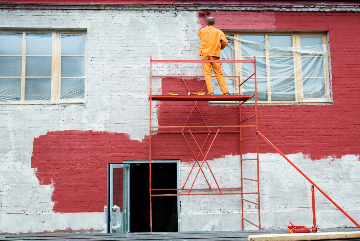
Most exterior color palettes use a three-part structure. First, select a main body colour for walls or siding, such as Resene Half Truffle, Dulux Lexicon Half, or a deeper Resene Masala or Behr shade from the Exterior Color Fade Protection Palette. Next, choose trim paint for window sills, door casings, eaves, and other frames. Trim is often lighter to sharpen lines, though dark trim on a light body creates bold definition in contemporary designs.
Finally, we chose an accent color for the front door and a few exterior details. Deep shades like Resene Nero, Oxford Blue, Loyal Blue, or Resene Woodsman Pitch Black create a strong focal point. Often, designers like Kate Alexander or Kim Wolfe add a playful yet controlled accent to one element, such as a front door referencing a garden hue like Jacqui’s petals, while keeping the rest of the façade restrained for timeless appeal.
Leverage Professional Products and Technical Features
Selecting high-performance products is as important as the right hue. Exterior coatings like Dulux Weathershield are durable, while specialty ranges from BEHR or BEHR PREMIUM ALL-IN-ONE WOOD protect trim, decks, and timber. Features like One-Coat Hide, Stain-Blocking Primer, and Fade Protection help the color stay true over time.
When health and sustainability matter, we seek GREENGUARD® Gold or Zero VOC products to reduce emissions during application and curing. For wood, BEHR PREMIUM ALL-IN-ONE WOOD CCCC or similar products pair with stains like Resene Woodsman Pitch Black to protect and enhance grain. The right finish is key: flat hides wall flaws, satin or semi-gloss on trim adds definition and cleanability.
Test with Sample Pots, Paint Chips, and Digital Tools
Before committing, we always test our shortlisted colours in real-world conditions. Sample pots let us paint generous swatches on different walls and observe how Resene Quarter Black White, Dulux Snowy Mountains Quarter, or Behr neutrals change throughout the day. Paper paint samples, paint chips, and colour cards from Benjamin Moore, Sherwin-Williams, Farrow & Ball, Resene, Dulux, and Behr are useful for initial curation, but they should not be the final basis for decisions.
Digital tools refine color selection. A 3D model, from an architect like Darren Kerr or Dion Seminara Architecture or consumer software, lets you try color schemes virtually. Online resources like HOME DEPOT’s paint calculator or brand-specific tools help calculate quantities efficiently. Many brands offer virtual visualizer apps to experiment with options like Dulux Weathershield Merlin, Oxford Blue, or Resene Ironsand on your façade.
When applying samples or final coats, use the right tools, like a polyester roller for smooth walls and trims. Good surface prep ensures features like One-Coat Hide and Stain-Blocking Primer perform as intended, reducing the need for extra coats and touch-ups.
Coordinate Colours with Windows, Roof, and Surrounds
A considered exterior palette goes beyond walls and trims. Vinyl windows, aluminum frames, or timber joinery each suit different complementary colors. Light vinyl windows pair well with softer trims, while dark frames anchor bolder schemes. Stone, paths, grout, and roof shades should be reviewed together before finalizing paint choices.
In heritage contexts, such as a Victorian building, it is especially important to coordinate colours with intricate exterior details. Brackets, cornices, balustrades, and verandah posts can either be simplified with a limited palette or highlighted with more complex schemes, depending on the desired effect. Publications and videos from Habitat TV, plus case studies shared by professionals like Kate Alexander, Kim Wolfe, Jim Smith, or Paper Moon Painting, offer real-life examples of how carefully chosen trim paint and accent colours can respect period character while still feeling current.
Seek Expertise When Needed
Because exterior paint colors are so visible and relatively long-lived, professional input can be invaluable. A color consultant familiar with brands like Resene, Dulux Weathershield, Benjamin Moore, Behr, and Sherwin-Williams can quickly narrow thousands of options into an appropriate short list. Architects and designers, including Dion Seminara Architecture, Darren Kerr, and content creators from Habitat TV, bring a deep understanding of how exterior house color interacts with architectural styles, window proportions, and site conditions.
Retailers and manufacturers also offer support. HOME DEPOT’s Behr Technical Experts, Benjamin Moore dealers, and specialist stores for Farrow & Ball or Resene often have staff who can comment on regional trends, durability in local climates, and best-practice combinations. Online resources and social channels from practices like Paper Moon Painting or design commentators such as Kate Alexander frequently showcase before-and-after transformations that illustrate how different colour palette ideas play out in real homes.
Plan for Longevity and Maintenance
Finally, we align our choices with realistic expectations for longevity and maintenance. Colours with timeless appeal, such as balanced neutrals or subtle nature-inspired hues, typically age better than highly saturated trend shades. An exterior white paint like Dulux Snowy Mountains Quarter or Resene Quarter Black White, combined with gentle contrast from Resene Half Truffle or Dulux Weathershield Merlin, can feel fresh for many years without looking tied to a fleeting fashion.
We also consider how easily dirt and stains will show on the chosen hues and finishes. In high-traffic or exposed areas, slightly deeper colours may hide marks better than very bright whites, while satin and semi-gloss finishes on door casings and window sills make cleaning easier. When we pair sound maintenance planning with high-quality systems such as BEHR DYNASTY™ or Dulux Weathershield and emphasize proper application with tools like a Polyester Adhesive Roller Cover, we set our exterior up to stay beautiful and protected for longer.